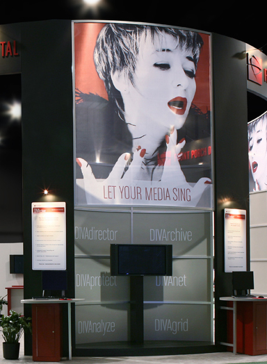
 In a sea of exhibits in a crowded trade show hall, your graphic design—along with your overall exhibit design—plays a crucial role in attracting attendees to your booth space, and providing that memorable impression that you need to make to your prospective audience. Your design needs to be attention grabbing and impactful. Here are some tips to keep in mind when creating the graphic designs for your next exhibit.
- Design for distance. Many of your exhibit and event graphics need to be viewable from a distance, so keep this practical consideration in mind as you’re designing your content. There’s a huge difference between designing a billboard versus a brochure, or even a sign that’s meant to be read while you’re standing a few feet away. This great article gives you additional tips on how to design for large format graphics.
- Design for space and traffic patterns. In terms of space, familiarize yourself with the position of your exhibit space in the hall, and understand your attendee traffic patterns. Spend time and money to design graphics for areas in your exhibit that will be most visible and visited by your attendee.
- Be consistent. Successful graphic design relies on a consistent message, especially with an event such as a trade show. Your marketing communication efforts for your trade show can begin several weeks or months before the actual show date. Think ahead and plan your exhibit graphic design strategy to make sure that your message and layout is consistent with all your pre-event marketing efforts—including your email announcements, website landing pages, social media pages, and advertisements. When the attendee finally steps into your exhibit space, they should see the visual tie-in with your pre-event marketing communications, and your exhibit graphics and printed material that you’re handing out on the trade show floor.
- Design for your audience. Know the audience that is attending your trade show or event—and more specifically—the audience that you’re trying to attract to your specific exhibit space. Use imagery, words, and colors that appeal to them and make an impression.
- Integrate graphics into your exhibit design. Work with your exhibit and event designer to really integrate your message throughout the overall exhibit design. Before you begin an exhibit design, know ahead of time the main messages you want to convey, and your marketing communications approach for your trade show. This will help your exhibit designer plan and design an exhibit that utilizes exhibit graphics in the best way possible.
- Use other media. Your graphic design doesn’t stop at static printed graphics. Think of how your message and designs can be augmented and complemented by lighting, specialty graphics (floor graphics, gobos, etc.) digital displays with motion graphics and interactivity, and audio.
- Design for your budget. There’s a multitude of graphics options when designing an exhibit, but be realistic with the amount of money you want to spend on exhibit graphics. This will help you design graphics, and an exhibit, that maximizes your budget. For example, if you want to manage a more responsible graphics or exhibit budget, design high-impact graphics that can be represented in single color vinyl vs. full color digital prints or specialty graphics.
 With just a little thought and planning, you can design graphics for your exhibit that will set you apart from the rest.
Do you have any other tips for designing your exhibit graphics? Let us know by replying to this post. We would love to hear from you!

