 Putting your Name Out There
Having your brand displayed correctly on your exhibit graphics is crucial. Start off on the right foot by having the proper file formats for your logo, so it can be reproduced at the best quality and with the correct colors. Providing a vector based file (.ai or .eps) will ensure that your logo can be resized without any quality loss and printed on many different substrates. If your company has brand standards that specify Pantone colors, always include that information. Pantone is a standard color matching system for printing and manufacturing that allows for consistent color across graphics and exhibit components. Using the Pantone system allows us to make sure you have a cohesive look for all the exhibit graphics being created, so there are no inconsistencies in color on the show floor.
Less is More
No need to fill your exhibit graphics with large quantities of information or long product descriptions. Let your graphics grab the attention of attendees and pull them into the exhibit space so you can interact with them and present the information you want them to know.
Using simple layouts, smart text placement and quality photography, you can create a great first look for your exhibit graphics and space to get the attention of attendees you are looking for. Sometimes, graphic layouts get too busy and the message they are trying to convey is completely lost. Now you’ve just spent money on a panel that is not doing any work for you.
Know your Sizes
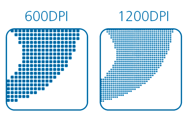
Talk with your exhibit house and understand what the final graphic sizes will b e. It’s hard to grasp how large a 10’ x 20’ fabric panel will look like when it’s finally installed, especially when you’re designing it on a computer screen that’s not even 25% of the size. Graphic sizes determine the quality of photograph needed, so understanding final sizes can help with creating or obtaining photos with the proper resolution. We normally try to have the final full scale images between 72-150 PPI (pixels per inch) depending on the size and viewing distance of the graphic. Supplying images at 25-50% of final size will work, as long as the resolution is 300 PPI or above. That allows the image to be enlarged without losing too much detail. If you’re feeling unsure about the quality of your images, talk with the graphics department and they can determine what images will work best for your exhibit graphics.
![]() Adobe, What?
Adobe, What?
Terminology is something that can change fast and if you are not up-to-date on the latest software and file formats, you may feel left behind. Knowing the difference between an Illustrator file (.ai), Photoshop file (.psd) or even understanding vector vs pixel will help when it comes to speaking with the graphics department about your exhibit graphics. If your design staff is limited or maybe you lack an in house design team, we can help design or guide you thru terminology that may seem foreign to you. With years of knowledge and our in house printing capabilities, we are here to create exhibit graphics that will help you be successful.


