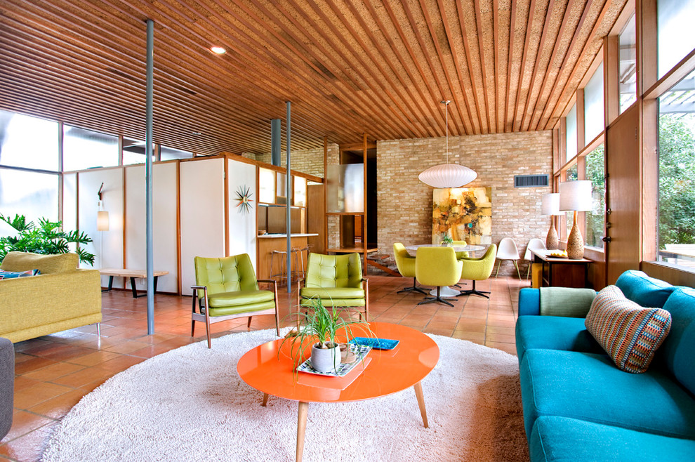
 From about the 1930’s to the 1960’s, design was specific to architecture, furniture, and graphics. This era of design was called mid-century design, giving prominence to designs and designers that came about the middle of the 20th century. The mid-century modern movement was part of the later period of the Modernism era which took place between the late 19th and early 20th centuries.
The term “mid-century modern” was coined by author Cara Greenberg in 1983, in the title of her book Mid-Century Modern: Furniture of the 1950s. Other design movements from Brazilian and Scandinavian architects were very influential at this time, with a simple design aesthetic and an incorporation with nature. To introduce modernism to the public, the style of mid-century modern was mostly incorporated within the architecture of the American post-war suburban neighborhoods. Mid-century architecture involved angled roofs, giant windows, and open floor plans, with the intent of uncluttering interior spaces and the idea of introducing nature with the indoors which encouraged families to explore living in different and new ways. Form and function were equally important to mid-century modern design with the goal of catering to the needs of the typical American family.

Other than architecture design, the mid-century modern aesthetic was included in industrial design and graphic design, as well. Scandinavian design was very influential during the mid-century modern movement. Scandinavian design aesthetic would be best described as clean, simple, and natural shapes, both organic and geometric. Most mid-century design is notable for furniture pieces designed specific to the 20th century such as chairs, lights, tables, and even radios. From what I’ve seen, the characteristics of Scandinavian design include color, wooden legs or feet to lift the object off the floor, and the use of different materials. Anytime I see an object with tapered legs I immediately think of the mid-century modern era, which always catches my eye and intrigues me.
Mid-century design has been of interest to me for the past couple of years. Something about the aesthetic of clean and simple shapes of mid-century furniture evokes a type of airy and elegant, yet fun and relaxing lifestyle that I want to have myself. Having a home filled with mid-century modern pieces would show a glimpse of my life and personal aesthetic as a designer.
Mid-century Design x Exhibit Design
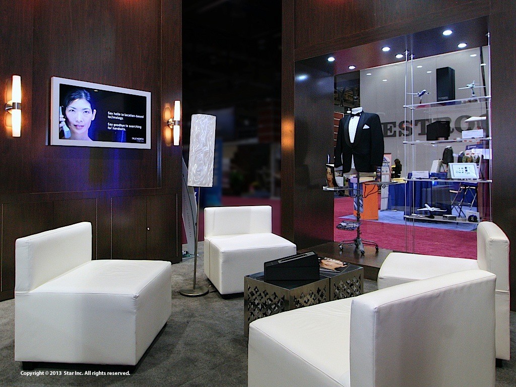
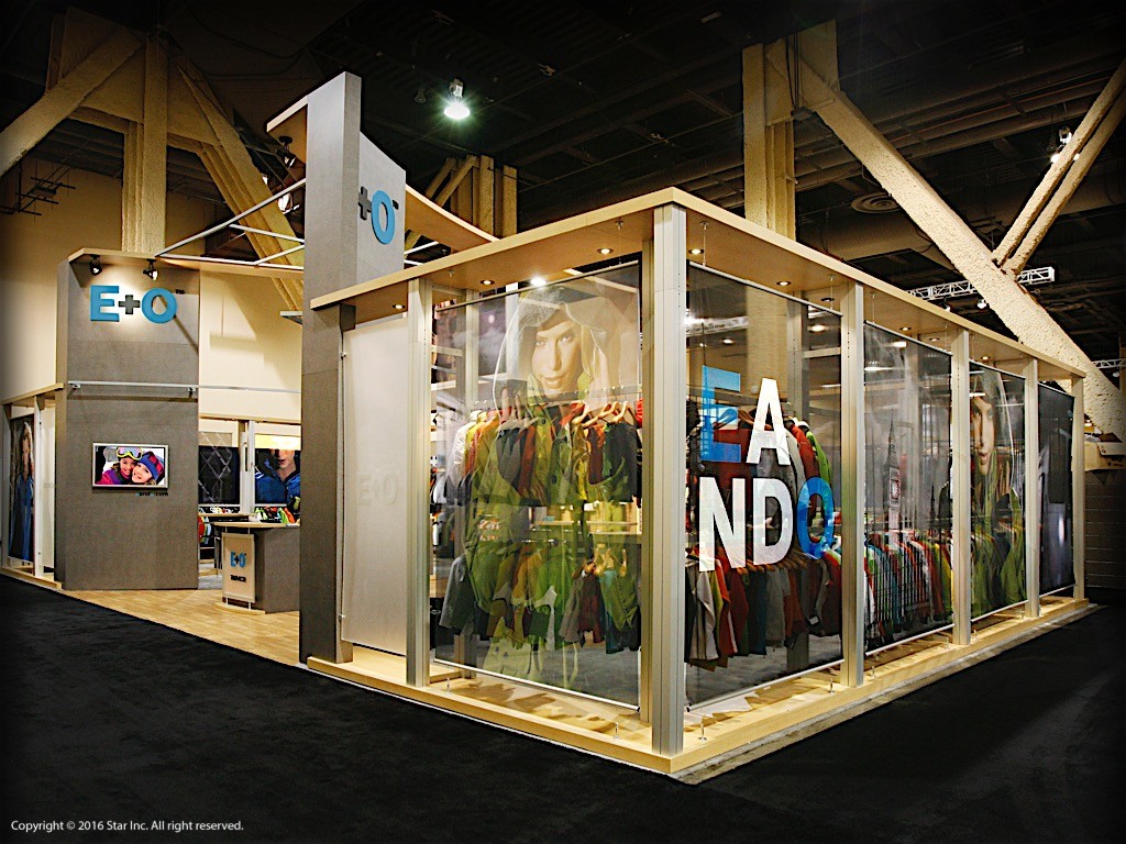
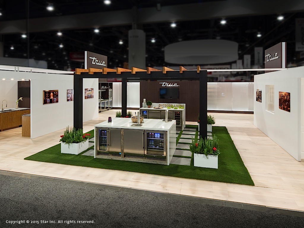
Mid-century design can definitely be incorporated within exhibit design. Color, natural materials such as wood, and simple details would make an exhibit standout at a trade show. Some furnishings like colorful couches and chairs with wooden legs or even geometric sconces for lighting can add a modern touch. Angled structures and cantilevers (n. a long projecting beam or girder fixed at only one end, used chiefly in bridge construction) would also pay homage to classic mid-century aesthetic. Here are a few examples of our work that have a little mid-century touch…
••••
For further information, press inquiries, news, additional editorial content, press photos, or to schedule a consultation, please visit us at starincorporated.com.
Follow us on Social Media:
Facebook: @starincorp
LinkedIn: @star-incorporated
Twitter: @star_inc
YouTube: @starincorp
Instagram: @starincorporated
Subscribe to Star’s Email Newsletter here.

