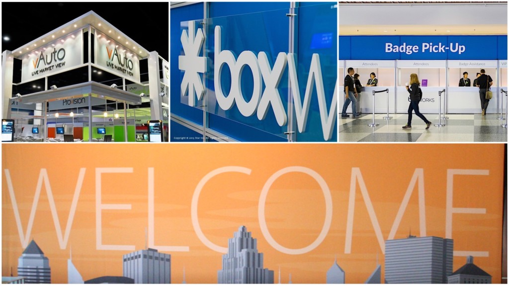
One of the many challenges with any booth design is how to integrate your name and marketing messages on the exhibit for maximum impact to help draw potential clients into your booth space. Form and function play a vital role, and it’s important to find the right balance of color, contrast, lighting, and one often overlooked element: typography.
Used effectively, typography can be a powerful tool in helping to capture the attention of potential clients. Visibility is the key, so the size of text (letter height) plays an important role in determining how effective you are able to communicate your messages. If the typography is too small, it may go unnoticed. Too large, you may lose valuable real estate to effectively communicate what your message was originally trying to accomplish. So the viewing distance must also be considered for each area that displays your corporate logo, product, or messaging.
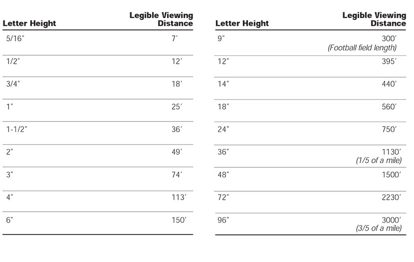
Below is a legibility chart that can be used as a guideline when preparing graphic text for display over distances. Color and luminescence are also contributing factors to legibility. However, if the letter height is not sufficient, or too large for the distance provided, it can be a detriment to how effective your messaging can be.

Source: Wayfinding, People, Signs & Architecture, Paul Arthur, 1992
••••
For further information, press inquiries, news, additional editorial content, press photos, or to schedule a consultation, please visit us at starincorporated.com.
Follow us on Social Media:
Facebook: @starincorp
LinkedIn: @star-incorporated
Twitter: @star_inc
YouTube: @starincorp
Instagram: @starincorporated
Subscribe to Star’s Email Newsletter here.


